




Before I leave today for a two week visit with family in South Jersey and Myrtle Beach, SC, I want you to immediately click this link to Sharon B's TAST 2012! All the details are there -- in case you haven't already signed up.
I haven't posted in awhile, so we'll have a ketchup fest when I get back. Promise!!!
Tuesday, November 22, 2011


Friday, May 20, 2011
LAYERS UPON LAYERS
FROM THIS
TO THIS

I've just completed Week 2 of the Strathmore Workshop Series 3 of art journalling techniques with Roz Stendahl. The assignment was to build upon some of the papers from the first week using layers and layers of mixed media to create a journal page spread. I actually began with new background pages in my watercolor paper SVJ
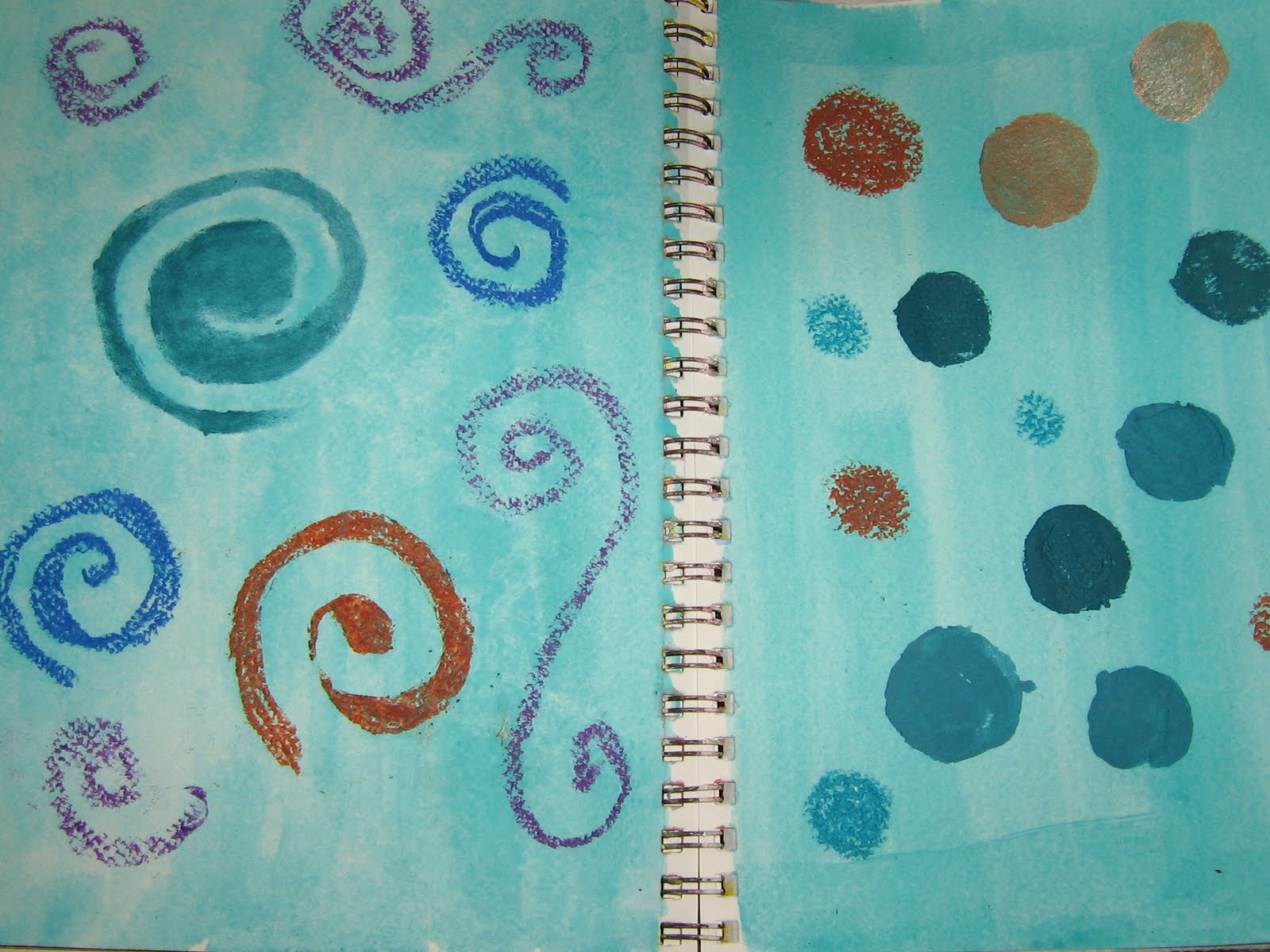
(Strathmore Visual Journal) because the Sketchbook Challenge theme was resist and I was curious to learn which of my color media could work as resists. Here's my process, but be aware I wasn't dutiful about taking notes and that I likely used more than one color of the various products.
1. Pigmented acryllic ink over resistsResists were oil pastels (loosely applied to let background color show through), acryllic dabber
(Adirondack), Mica Magic ink, and acryllic paint.

torn pieces of hand dyed, unbleached coffee filter;
small circles stencilled with pigment ink pads through plastic litterbox liner -- the liner itself then applied as stamp; used postage stamps commemorating scouting and a repro Depression era poster enlisting women to aid in famine relief, dauber splats.


3. Muting background color
coffee stain over pix; chalk smudging, spray with Tattered Angels


Background colors and designs were still too bold. I applied bits of aqua colored tissue paper, followed by a thinned down coat of gesso, then dabbed up from the center and onto other parts of the pages. Wrote in central area with sepia pigment pen, then added random shreds from tea dyed cheesecloth for texture and for partial concealment of writing. A final spritz with terra cotta stain before adding torn strips of tea dyed muslin lettered with my theme: values passed down from the grandparents I never knew.


Saturday, May 07, 2011
PAPER PLAY
First assignment for the Strathmore Visual Journal Workshop, Series 3 is to build layers of background color & interest for several journal pages. For this I'm working in my Strathmore Visual Journal, 140#watercolor, 9x12 and a Canson sketchbook of the same size but paper not really suited to wet mixed media. Our instructor, Roz Stendahl suggested we experiment different journal papers, so later I'll try some of the other SVJ's Here's what I've done so far on these 2-page spreads. The colors are not showing properly!

The Sketchbook was the same in color, which is sunnier than above shows, btw.

Top-VSJ: overwashed with Tim Holtz/Ranger Distress dye ink, dried marigold.
Bottom- is the sketchbook; it took on more color than the watercolor paper.

SKbk: overwashed with Dylon Coldwater dye, camelia. I've had it around a couple of years; I use it for staining papers and fabric now. It absorbed faster than I could blot,so I got a brighter stain than I wanted. I used it more sparingly in the SVJ, which you can see below on the right side.
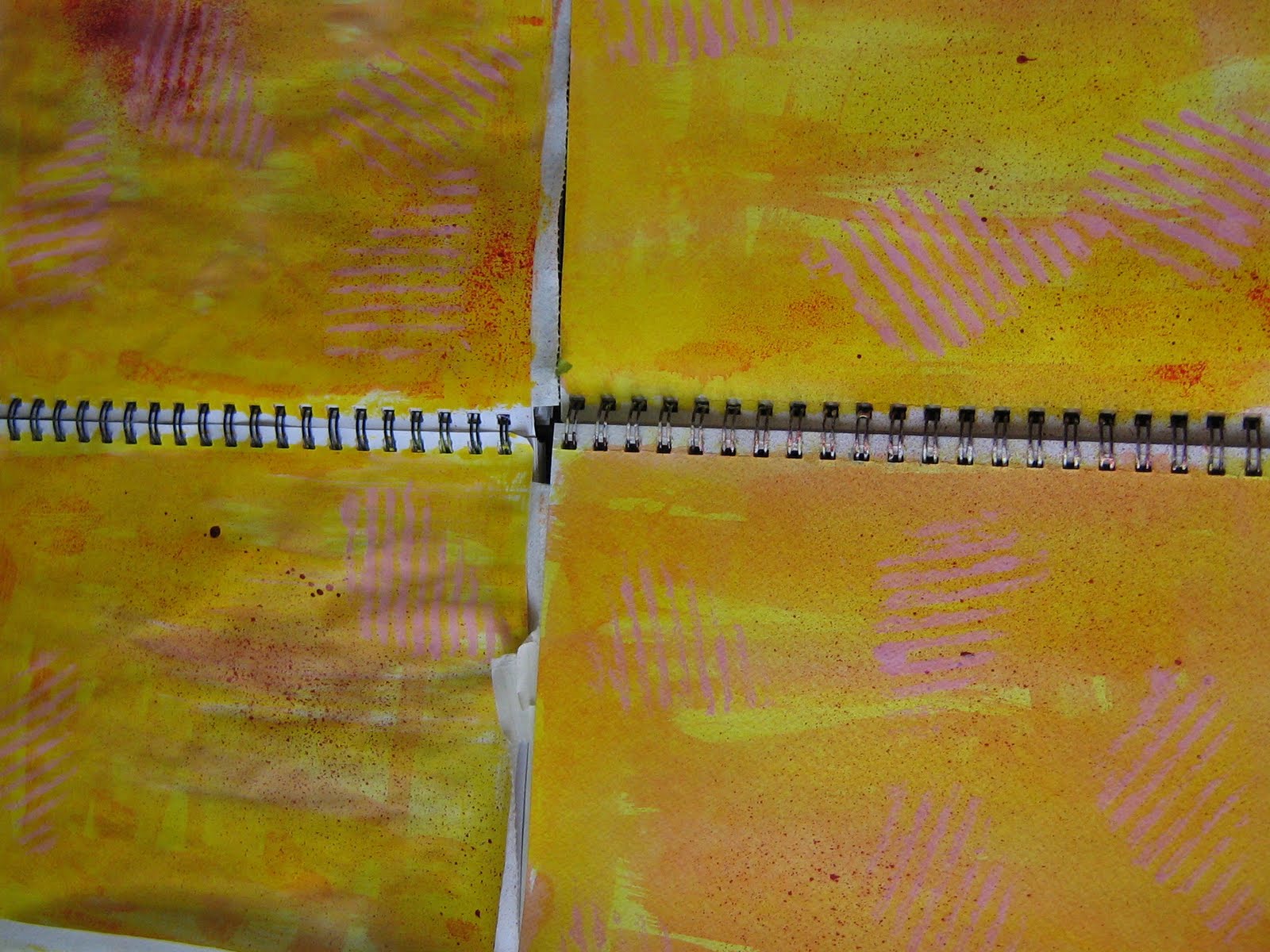
The left pages have been washed with diluted walnut ink and quickly blotted up. It left a yechy, drab stain which is why I did not use the walnut ink on the right. I did give a slight spritz to all pages with some diluted walnut ink in terra cotta. And somewhere early on a gave a spritz of red Smooch, just a touch -- probably doesn't show up.

This is the step before the walnut ink treatments. I made marks with a scrap of cardboard, inking the corrugated side with a Brilliance pigment ink pad in pearlescent coral. It was then that I spritzed with red Smooch.

Top- Skbk; bottom - SVJ

This is how my VSJ watercolor pages look so far. I stencilled dots using the center cut from a catbox liner, the kind with holes in the center that you layer over a solid liner. You clean the box by lifting the holey liner which strains the litter back in the box. I found it easier to simply scoop, so I stopped using the layered liner system. The violet is a ColorBox catseye in sunflower -- no, wait! I must have switched lids. The orchid dots are Brilliance pearlescent orchid. You'll note a little flower motif here and there? I used the plastic mold from a gel air freshener.

And here I am with the sketchbook pages at present. More to come.
Subscribe to:
Posts (Atom)
