About Me

Monday, December 24, 2007

A VERY SPECIAL HEALING DOLL


This is the last of the three healing dolls from Mai-Liis Peacock's online class from Joggles. For me it is the most special because of what I experienced during her construction. It's very personal, so I'll share the story at the end in case you'd prefer to skip it.

Mai-Liis patterned this doll form to accomodate a fabric image of the Virgin of Guadalupe as a means of teaching us the image transfer process. Since I happened to have that particular fabric, I simply fused it to a background of similar color, then planned the rest of the doll. I loved the idea of following up with a Hispanic theme using bright, jubilant colors, opulant texture, and ornamental detail just shy of overkill , yet preserving the reverence and dignity of a traditional style. Neither Catholic or Hispanic, I in no way wanted to create a mockery, but I realized religious festivals throughout Latin America are celebretory, an occasion like the Day of the Dead is an excellent example. Still I would need to select the recipient carefully.

Actually I'm gifting this doll to two persons. I will give it to a friend who recently and unexpectedly lost her daughter to cancer and who herself has since been diagnosed with lymphoma. It is my wish that she will someday pass the doll on to Hope, her granddaughter, the little girl adopted from Guatemala by the deceased. In the detail here you can see two of the charms I selected as milagros. The angel represents Hope's mother. I hope my friend will take comfort from the Blessed Mother's posture of prayer and loving expression.


Some additional notes on this upper portion of the doll. The crown or halo is comprised of 3 shell sequins stitched with seed beads. I embroidered the roses with 2 mm silk ribbon and scattered more seed beads among them and using another for the jewel at her collar. I stitched a chain with gold thread to "attach" the charms. These charms were pewter. I used some really old and dried out Treasure Gold on the angel. I realized my entire collection of Treasure Gold colors was dried up. When my attempts at microwaving didn't work, I contacted the company and was told a few drops of Xylene (on which the products are based and available at hardware stores) should soften it up. The hope charm didn't fare as well with the Treasure Gold, so I painted it with the same gold Lumiere I used to seal the edges of Our Lady's veil, a piece of silk chiffon hand dyed in an earlier experiment with an acid dye. I then varnished the charms. The raw edge at the end of the fused fabric bothered me , too abrupt a change. The tri-colored ric-rac seemed to do the trick.
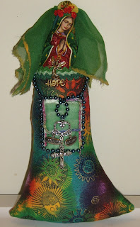


An essential healing stone for this doll was an undrilled chunk of obsidian purportedly mined at the location of the incident from which the story of Apache Tears evolved and is reputed to be a powerful agent to ease grief. A pouch was needed to hold one the larger stones and others collected for their healing and protective benefits. Hung over the pouch (made from velvet ribbon and stitched closed with decorative embroidery) are four additional symbols I deem essential to healing and living: love, courage, balance and faith. I used a strand of beads to girdle the figure and frame the pouch.

I made the cloak from silk velvet and used bright confetti fringe. Although this is a doll that particularly addresses grief, I wanted the overall effect to be light, not somber, and hopefully bring a smile to the beholder. I used Stef Francis silk floss for the simple chain stitching and help blend the multicolor of the background fabric and the fringe. I debated a closure for the cape, but opted to use none. Instead I just tacked it together at the neckline and let it hang from the doll's neck.

A remarkable thing occurred as the doll (whom I began thinking of as La Senora) neared completion. I became aware that the grief I was holding since the death of my own daughter two years ago was lifted. I can now talk about her without tears, and today, the anniversary of her passing, I will visit her grave for the first time since the funeral. I know that once I knew the purpose of the doll I was happy when I worked on her. I thought a lot about the grieving process and hoped the comfort I was starting to feel would be played forward through the doll.
I should also mention that when I purified the stones for this doll, I cleansed a piece of the same obsidian for myself. It sat next to me the entire time I fashioned the doll.


Here are my three dolls together, ready to go to their new homes. The Diva looks like she's inviting everyone to love life and celebrate diversity. December 26, 2007




Wednesday, November 28, 2007

HEALING DIVA


My second doll for Mais-Liis' healing doll class. She was so persnickity during the construction process, I decided she was a diva, demanding and opinionated. She has a mind of her own, and she wanted me to know it. I allowed her to have her way, which, in the end, is probably a positive thing, for as outrageous as she turned out, she has enough sass and brass to make a believer of any skeptic. She needs to be a take charge doll, as her recipient suffers from lupus.


I like the mask concept -- good because none of the faces I had on hand seemed to fit -- so I chose a sun ; it goes well with the fabric I actually picked for my third doll. I try to use glue sparingly, but it couldn't be avoided since there was no other way to apply the sun. It's a little too small, but I justified it as a mask which wouldn't cover the entire face. Well, it's on to stay, and Diva Dearie is stuck with it. By the way she bewailed the fact that my photos are truly terrible (hence you can't see how well the gold of the sun works with the other gold embellishments), but I drew the line at taking her to a professional portrait studio.

Next came the hair. I envisioned a feather headdress and crocheted a "wig" with feather yarn
(the color is Phoenix!). Diva Dearest said it looked like a bad coonskin cap and insisted I cut off the long braid which was to have doubled as a boa. Some compromise is good. Then she got into the stash I was auditioning for Doll #3 and had to have the gold trim I purchased in CA and was hoarding for a project with a decided Hispanic flair. After throwing a tantrum in my head, she prevailed. What to put the braid on? My thought was a poncho. She demanded a kimono.
Some compromise is good. I did pick the fabric; it's wool that I fulled (felted) from a thrift store skirt. The trim turned out to be stiff and very fragile, and hand stitching was not an option. I used glue, but it seems to exaggerate the stiffness. I wasn't able to machine stitch either , sigh, because DD was already wearing the fitted (showing off her tiny waist) garment I'd best describe as a hapi pullover with obi.

DD's dainty, reversible brass hands were flopping like flippers. I stabilized them by beading bracelets. Called for something around the neck. I thought beads from the bracelets could be stitched around the opening. Oh no, DD wants something grander, an Egyptian style collar, for goodness sakes. I think it's excessive, but she's the gal who's going to wear it. I think I was able to tone it down some using bugle beads the same color as the background.


The remaining dressings went easily and surprisingly without confrontation. The healing stones are nestled in silk satin inside a pouch I crocheted with gold elastic. I embellished it more heavily than I might have otherwise, but my hope was to counterbalance the top heaviness. The bow and eye bead got off center from the back of the obi. I couldn't correct it without ruining the trim -- and I certainly wasn't going to waste another inch of it! DD pooh-poohed the idea of a headband, but I convinced her some ornamentation was needed to interrupt the explosion of hair. I couldn't come up with a means of fastening hair sticks from which to dangle baubles. Instead I made a bead cluster with three gold leaves and a cloisonne butterfly charm. To complete Her Glitziness, I loosely wrapped her with 2 kinds of gold thread.

Tuesday, November 27, 2007

FREEFORM ORNAMENT AUCTION!!!

Follow this link to the International Freeform Crochet and Knitting Guild's site for info on a silent auction of scrumbled ornaments which adorned the Tree of Life, Tree of Peace exhibition!
100% of the proceeds will be donated to Women to Women International!!! Cool stuff, great Cause!

Wednesday, November 21, 2007

HEALING DOLL #1, Harmony


This is my first completed healing doll made for Mais-Liis Peacock's current class at Joggles. This is Mais-Liis' harmony doll pattern which I made up in a batik. I wanted to go a little more "formal" with this doll because of the potential owner, so she lacks the woodsy nature of the sample doll. I cloaked my doll in a remnant of silk paisley, and I crocheted a turban with metallic copper and faux feather yarns. I then draped her with incredible novelty and hand painted fibers. For additional personalization I placed a ruby red crystal on the headpiece to represent the recipient's birthstone and added an elephant (which the future owner collects) as a good luck symbol. I also placed an evil eye bead on the rear of the turban to watch her back, so to speak.
My doll wears a sacred heart milagro over own, and after much consideration placed the special healing stones on the dolls tummy, giving her a pregnant look which I decided was appropriate since I think of my friend as a nurturer.
It also occurred to me that cloaking the stones would protect them from impure handling or curious fingers of grandchildren. This doll is not a toy! I have hidden other healing items inside the doll and even in her ruana, and each thing is there for a specific reason. I had purchased several pewter charms with words like faith, harmony, balance, courage, but have decided they would be aesthically and spiritually superfluous.


Tuesday, November 06, 2007

CAT SACK - Lesson 1


My Joggles class is on Lesson 4. I am not quite finished with Lesson 1; I still have to make the "sandwich".
Then comes FME (free motion embroidery) on the machine, as I have opted to do no fusing. When that is done, I'm sure the basic front and back you see here will no longer be recognizable.

Saturday, November 03, 2007

HOW NICE FOR ME

I know zilch about Tarot cards other than finding them a little on the scary side, but I couldn't resist taking the test just for fun.


You are The Empress


Beauty, happiness, pleasure, success, luxury, dissipation.


The Empress is associated with Venus, the feminine planet, so it represents,
beauty, charm, pleasure, luxury, and delight. You may be good at home
decorating, art or anything to do with making things beautiful.


The Empress is a creator, be it creation of life, of romance, of art or business. While the Magician is the primal spark, the idea made real, and the High Priestess is the one who gives the idea a form, the Empress is the womb where it gestates and grows till it is ready to be born. This is why her symbol is Venus, goddess of beautiful things as well as love. Even so, the Empress is more Demeter, goddess of abundance, then sensual Venus. She is the giver of Earthly gifts, yet at the same time, she can, in anger withhold, as Demeter did when her daughter, Persephone, was kidnapped. In fury and grief, she kept the Earth barren till her child was returned to her.


What Tarot Card are You?
Take the Test to Find Out.

Tuesday, October 30, 2007

THE ICE BLOSSOM PRINCESS

The first thing you should know about Ice Blossom is that it is cold where she comes from. She is not having a bad hair day; she is wearing an fur hood (faux, to be PC), Arctic fox dyed to match her ensemble). She's not fat, I mean fluffy, she's bulked up in layers for the freezing climate! To Ice Blossom each snowflake is a unique and magical flower. She was made as a gift of friendship to teach her new owner to make bouquets in the wonderland of winter instead of pining for spring bloom.
Ice blossom was created for a holiday friendship doll exchange within the International Crazy Quilt Group. Guidelines stipulated she must be pieced and embellished CQ style with an emphasis on beading.

Saturday, October 20, 2007

GETTING READY FOR SCHOOL

These are batiks I bought yesterday for Michelle Verbeek's Cat Sack, an online class at Joggles. The class is already on Lesson 2, so I'm eager to get started. The project is a quilted handbag and uses non-fused applique or layering and FME (free motion embroidery) in the technique. Here's hoping I'm not in over my head!

As if I wasn't fretting enough already, a supply list for another Joggles class came the other day. I signed on for Mai-Liis Peacock's Healing Art Doll session. I picked up a couple of batik fat quarters for this, as well.

Both supply lists called for batiks or handdyes. I was shocked to discover how few I had in my stash. I will address that problem forthwith!!!

Tuesday, October 16, 2007

TAST 41 & 42: Lace Border & Twisted Satin Stitches


I wasn't that thrilled with the lace border stitch. Instead of working up light and frothy, Ithought it was an awkward stitch and probably wouldn't be put off if it were called something else. I had difficulty with consistency and felt my stitches looked sloppy compared to others I viewed that were tidily rendered. Still I wouldn't discard it from my repetoire.
I started the horseshoe shape with #5 cotton perle, trying a curve and variegated heights. The half crescent at the bottom was my attempt to slant the stitches. The vertical squiggles next to the to that I just loved with it was just the perle, sort of a freeform zigzag by altering the sides.
Unfortunately I realized it was the lace border stitch, but a ziggy zaggy coral. I attempted to
remedy by going back with the metallic, but without good results. Had I tried this with an even line of stitches it might have worked. I tried to repeat the zigzag look above in lace border just with metallic. Unh. Not crazy about it. Back to the horseshoe (kinda) shape. I used the metallic to work the back side of the curve and was satisfied; however, later I tried to fill in with an the metallic worked over the inner curve.
Since there was still space I chose to fill in with this week's Twisted Satin stitch. I liked this stitch and will likely use it often. I found the metallic a little hard keeping tension; I'm sure this wouldn't be a problem with another thread. I used long and short stitches for the motifs. I tried an extra wrap with the longer ones, but abandoned the idea. For the beaded version I did the same with pattern. Again, maybe it was the thread, but I don't like how the beads move around, especially on the longer twists. Maybe a second bead? I really meant to try placing the bead on the straight stitch before the wrap to see if there would be more stability. Maybe this is was what we were supposed to do and I misread. I'll go back and check.

Monday, October 08, 2007

BREAKING AWAY


BREAKING AWAY
Originally uploaded by Fiberdabbler
PINK FOR THE CURE! After receiving an invitation to join
www.flickr.com/groups/passionatelypinkforthecure/
I decided this picture would be especially appropriate to submit. Consider it breaking the bonds of breast cancer. Since the shisha
"mirror" is actually a coin, let it serve as encouragement for others to donate for the cause.

Uploaded by Fiberdabbler on 20 Sep 07, 11.54AM EDT.

Sunday, October 07, 2007

DRAGON FIRE


TAST 33 - Scroll Stitch
TAST 34 - Portuguese Knotted Stem Stitch
TAST 40 - Linked Double Chain
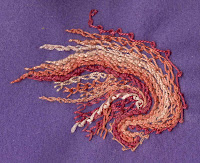
I gathered cotton perles and flosses in shades from peach to burnt orange, added a spool of sparkly peach ribbon (2mm) and went to work on a piece of craft felt. My only intention was to make lines of textured color utilizing missing TAST stitches. Honestly it's just an abstraction, although I admit I thought of flames and feathers, a swan, a dragon, even a shrimp. I also thought of underwater plantlife and dried grasses. I resisted temptation of depicting anything and just kept following my initial line of knotted stem with some deviation here and there for interest.

Tuesday, September 25, 2007

TAST 38 & 39 CITYSCAPE, 3:00 a.m.

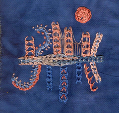
As soon as I started the knotted buttonhole bands I sensed they would take on an architectural element. I started staggering the top peach bands with skyscrapers in the back of my mind. I thought they looked like pieces from an erector set, but soon I was thinking bridge girders!

Unfortunately I began the sampler with the center horizontal band. I used a Caron Watercolours, and I have to say I've come to the conclusion that the color spacing for these threads is too long to add anything special to my sampler works unless used as a border. In other words, I'm wasting specialty stash! For this band I made the foundation bars (sparking ribbon that doesn't particularly show up) of different lengths, so in the wider areas I could work extra stitches or half stitches. I rather think it looks like a macrame bracelet. It's positioning then limited my working area. I decided to pretend it was a double decker bridge and considered making reflections of the buildings in the water below. Boring. Instead I switched colors and made vertical bands of different lengths and heights. Peach bands were angled at the end of the central band and perle cotton woven down the center. Nothing accomplished in doing this, unless maybe you look sideways and see a dragonfly.

At this point I abandon TAST 38. With all my catch-up TAST's I don't want to start over and I don't want to waste time. Imagine my surprise checking In a Minute Ago this morning to find TAST 39; I thought it was Saturday -- not only do I still have jet lag, I'm calendar challenged, as well.

To combine TAST's or not to combine? It occurs to me that before anything else I need to try to fill in the doodle and make an attempt at balancin the elements. This accounts for the scrolly thingy to add curve. I made the foundation bars with rayon ribbon and worked half a band stitch, reversing the direction midway. I wondered if this was really a knotted buttonhole stitch, but concluded that because it is worked over a bar, then it's legitimately half of a knotted buttonhole band. I next threaded more peach ribbon under the unstitched bars.
I wanted the bottom half to be heavier than the top. I began experimenting using a deeper shade of melon perle. I used the bottom of the blue half band as bars and worked the stitches from blue stitch to blue stitch. I did two knots, reversing the looping of each (I figured if I didn't do this, I'd be back to plain knotted buttonhole.). Above I used small straight stitches & French knots on the outer curve (reverse below). To get it more of the coral color, I did a short reversed buttonhole bar in two colors and made a "moon" using two rows of BH bar, alternating thread color every other loop.

I kept looking at this now very strange doodle and still couldn't get the idea of a suspension bridge from my mind. Of course! It's the Golden Gate! It's the San Francisco skyline as seen in the wee hours by someone a little tipsy. That big number 3 represents all the neon city lights. That leaning building on the left? Why that's the landmark Quoit Tower. That's my story and that's my hand dye in the background.

Friday, September 21, 2007

TAST 37 - RICE & BOSS STITCHES


I thoroughly enjoyed making this mini sampler in Rice and Boss stitches. The predominant thread used was Caron's
Watercolours in "Winter Wheat". I also used silk perles from Vicki Clayton in either "Bojii" or "Seaweed" and
"Dapple Gray". The darkest gray here is silk and wool yarn in laceweight. My background is a scrap I hand dyed with a mixture of bright yellow and fuschia.
My scanner has been wonky with color of late. Instead of the mellow harvest gold you see here, my background is actually a bright golden orange or orangey yellow. In fact, I think it's a leftover piece from Pinata.
As said I liked these two stitches and the effects I was able to achieve with mixing and matching. I hope to return to these and play more with blocks of color in the composition as Sharon showed.

BREAKING AWAY: TAST 35 & 36

CABLE CHAIN: #3 perle cottons and rayon floss and yarn worked on cotton duck background. If I'd known when I started I'd be adding the "shishas" , I would have stabilized the fabric. As it was I just let my needle meander in cable chains. I played with covering stitches as well as chains of assorted size. The 2-row arc at the top was made using two threads in the needle, alternating colors. The heavier chain to the left began with a chain of #3 perle doubled. Although it doesn't show clearly, the medium #3 was laced around both sides of the chains. I used pearl gray in #3 to lace one side only and used a double strand of rayon yarn to tack these 4=strand edges.

SHISHA STITCH: When I'd done all I wanted to with cable chain, I went on to the shisha stitch. Not having any mirrors, I made do with a quarter and a flatbacked acrylic "gem". The "jewel" is faceted and domed, making it difficult to stay within the base threads. I knew from past experience to use a dab of glue, but I skipped this step and the result is apparent with the sloppy, uneven stitches.
As often happens to me, I ended up flipping the sampler. I just think it's more interesting upside down as an unintended figure seems to emerge, and it looks like he's breaking the chains that bind -- or not.

NOTE: There is a great back issue of Piecework Magazine with an article on applying shisha with different stitches.

Thursday, September 20, 2007

MY SUMMER VACATION - Part 2

Arriving first at my father's home in the Bay Area, I'd've thought there'd be no trouble finding a computer for downloading the TAST stitching assignments. First stop in my quest the local library. Closed! What library is closed on a weekday??? Still early, I drive to the next library, a main library, and I should be early enough to find a parking space on the square surrounding it.
Hah! Circling the third time, I notice all the people waiting for the doors to open. All the people turn out to be teenagers. I'm thinking summer programs. I think again, "They're there to swoop down on the computers!"

Yellow pages give no promise of cyber cafes or nearby places for renting computer time. I'd call a friend, but I don't have any still in town. If I knew any of Dad's neighbors, I'd be knocking on doors. I briefly consider ringing random doorbells. Thankfully common sense prevailed over my increasing anxiety. Does anybody ever suffer withdrawal from homework? Finally, in the deepest, darkest, post-midnight hours of my despair, the answer comes: senior center!!!
Early morning finds me there (it's within walking distance!) delighted to find an entire room filled with computers. Apart from engagement in intriguing conversation with other users, I was easily able to print out 3 weeks of stitches.

Sorry to say, I never got back to the Bay Area until time to fly home. Typically during the summer, I'd get to Tahoe maybe once a week for shopping and errands. It's only a 10 mile drive, but involves a boat trip to a public landing with limited parking just to get to the car. Factor in windy weather and my limited stamina for getting up and down the granite steep to our cabin... I made my way to the South Tahoe Senior Center once, but the two computers there were occupied. I didn't bother with the library since it was still vacation time.

I savored the time to work on the stitches I had and also the beaded journal pages. When not absorbed in those activities I was reading. Thanks to my LED book light, I can read whenever insomnia strikes. I finished at least a dozen books, including several historical perspectives of
Native Americans. Obviously this was on my mind while working on this piece:

What could be more appropriate for this sampler than Arrowhead Stitch! I used that predominately along with Sheaf Stitch in cotton and silk floss and perles. The teepees I created with ink stained Tyvek leftover from "Rock Island". As I folded and manipulated the Tyvek, I thought about the early Lakotah women assembling their lodges and dismantling them again when the tribe changed encampment. The color of the Tyvek fabric seemed just right for the buffalo hide covers. The entry flap of the right teepee is open to show the interior blackened by smoke from the lodge fire and a little piece of fuzzy yarn is supposed to be the buffalo robe used for sleeping. Eagles, big horn sheep, elk, grizzly bears and trout were at one time prevalent in all our western mountains. Native peoples wintering there would have made their way to the plains for seasonal buffalo hunting. Having had to fell two small lodgepole pines this summer, I have new regard for those long, straight teepee poles that had to be dragged from camp to camp.

Go Fly a Kite! Why not kites, colorful, simple or fancy?
My kites always seemed to land in trees; still kites evoke for me images of happiness.
July
Seed, Delica and buglebeads embroidered on moire. The focal point is a vintage, design under glass cabochon from Germany. The floral called for a formal look, so my effort an attempt at scrolling lines with different golds and irridescence for a Baroque look . I tried not to clutter the background and let the flowers come to fore. Colors here are not accurate. Background fabric is a creamy ivory, and the golds are much warmer than appear here. The darker beads are more purple but with definite gold flash.

Thursday, September 13, 2007

MY SUMMER VACATION - Part 1

My vacation excitement included a forest fire (the horrible Angora fire at South Lake Tahoe and just over the ridge from our lake), a ranch wedding (bride delivered by her grandfather in a 2-horse buggy), a cattledrive, and a 90th birthday party.


My vacation sorrow included the passings of a cabin neighbor, a true blue friend, a near constant companion, and a beloved aunt just turned 90.

Despite the above, my vacation included much needed R&R with time for creative pursuits like unsuccessful but fun experimentation with chartreuse lichen as a dye, more rust dyeing (hatchets & stove plates work great, old screens don't), progress on my EGA hardanger project, completion of my July bead embroidery journal page and start of August's, two-thirds of a fringed bracelet, and keeping up with TAST as best I could (4 weeks down, 11 to catch up on), and teaching my daughter to scrumble (at forty-something she's decided to learn to knit and crochet and seems completely uninhibited about freeform). Here's what I got done.

TAST 26 - Half Chevron: I have to say the appearance of this sampler improves only slightly in the cloth; the colors do blend a bit better. I finished this piece waiting for delayed and cancelled flights on my way to California. I thought the raspberry stacked rows would be good for lacing with ribbon, but I didn't have anything that worked with me.
To be continued...


Wednesday, June 27, 2007

BACK IN SEPTEMBER!

I'm off on vacation, packing more supplies than clothing. I won't often have access to a computer, so I'm going to miss your blogs and eye candy. It is my hope to do the July and August bead journal pages and not get too far behind in our TAST adventure. I'll also be working on the More Options in Hardanger EGA .

Monday, June 25, 2007

ROCK ISLAND: TAST 25

I could fib and say this is a WIP, but the truth is I worked long and short stitch on an earlier experiment gone awry. Back when we did the woven and whipped wheels, I envisioned a tidepool filled with starfish. It was my first time playing with Tyvek, which was to be the rocky base for the pool.

All right, you have to picture upside down. I painted sky about a third of the way and left the rest in the neutral beige aida as that part would be beach. You can see the horizon line where my water begins with running stitch and woven waves. I recycled a used priority mailer, spraying it with various inks I had just gotten and was hot to try. I used the heat gun I bought probably 5 years ago for the first time and watched with delight as it bubbled and crinkled. The piece has been trimmed by half, but you can see how much of it utilizes the concave side of the bubbles, because, remember, this was going to be a tidepool with lots of little pools and rivulets. I added seaweed, white caps and crashing waves
and a few shore plants before I learned how tough the tyvek was to stitch through. I decided it would be an awful chore trying to hand stitch urchins, crabs, wheeled starfish -- the entire ecosystem of a tidal pool. I abandoned the project.

I've been pressed for time this week, but I did want to practice the stitch of the week and thought sky could be quickly worked on the aida. Obviously my pearls were not heavy enough for a dense covering, but it's blue sky. I haven't done long and short since my crewel days in the 70's. I've never liked this stitch because I think it takes a gentle, patient and skilled hand to render it properly. I know it's a vital stitch, but if not executed nicely and carefully it looks like, well, like my dandelion, I mean sun. And I must tell you that sun is only there out of the sense of guilt I felt for just doing the basic canvas version. My hats off to the many of you TAST'ers who created wonderfully clever and beautiful patterns and designs this week as well as L & S fillers as fine as any Japanese master.

As I mentioned time is short. I'm frantically gathering supplies for TAST and BJP to work on while I'm away.

Saturday, June 23, 2007

DRAGONFLIES ON THE HALF SHELL

This is my June beading, my first page for the 2007 Bead Journal Project initiated by Robin Atkins. If you haven't already heard of this undertaking, do take the time to read a brief description on the BJP blog site; it appears at the top in the left margin.

Thinking I might make a cloth book for these samplers, I'm making my "pages" rectangular with a one inch margin for binding. One of my goals with this project is to experiment on different beading surfaces and trying as many techniques as I can. I could well change my mind and do a decorative box to hold these pages, which I suspect may become heavy, especially if I do them back to back.
Okay, so you're wondering about the title, right? I cut a piece of craft felt and gathered my stash of purple and blue beads because I have more of them than anything else. I confess, I picked up a few more accent type beads at the craft store while I was there for something else, and you know you'd do the same thing! It was a focal bead I applied first and because it was 8 or 10 mm, I put size 8 seed beads to either side. I looked at the irridescence and thought it would make a great dragonfly. So I made one, then another. Then I went about surrounding them until they merged. At this point their irregular shapes made me think of an opened oyster. I suppose I was also thinking of another fave seafood sadly no longer available, abalone. If you've never tasted the meat, you've at least seen the shells. Those are the colors I wanted to bring out.

Laying down beads around the dragonlies I practiced 3 methods, couching, add 3/back 1, add 5/back 2. I decided the 3/1 system looked best for me, and I tacked down to the previous row as needed. My tension was too tight, but I left it that way because I liked the irregular surface that presented: wavy, like the lines themselves. By the way, the dragonfly tails end with 3 delica that are close but not the same as the surrounding color. They are laid in such a way the dragonflies might be emerging.

After the wavy, inner shells, I tried to be more careful with tension. I added the next color in the same stitch to bring the two shells together, but changed stitches after the first row. On the right I built a ruffle from comanche stitch; on the left I worked it into peyote, incorporating beads of different colors and size. At the bottom I alternated stitches with lines of color to change direction of the beads.

This is a much more dimensional piece than the scan allows, and the colors change with different lighting. My intention was a small composition of color and texture. I'm happy with the resulting design and hope it invites playful interpretations. Do you see two faces or masks or heads? Do you see a butterfly or exotic bird that has taken on a couple of passengers? For me it's enough if you find a pleasing arrangement of shiny beads.
Below: I have a goodly supply of purple and blues. I'm ready for a change of pallette and an excuse to buy more beads...

Monday, June 18, 2007

FRENCH KNOTS: TAST 24

TAST 24 called on us to practice French knots in different sizes
and fibers, and we were encouraged to use them in conjunction
with other stitches. Short on time, I selected a scrap of onionskin dyed cotton and used a small hoop (I normally stitch without). Without a pattern, using only the circle of the hoop as a guide , I started stitching. I began with a spiral of butterfly chain
stitches in #8 lavendar pearl. A leaf green silk floss gathered and linked the straight stitches, and I used the same to French knot the tops of the straight stitches and extend the line into a
curlicue. Next came the feather stitching in a strand of Watercolours variegated in teal, tan and rust, using the same thread for French knots and somewhat echoing the previous curlicue.

Stitching in the opposite direction I used wheatears and knots in mint green cotton floss. Keep in mind, the very first line and knots are medium to dark green! I like the organic nature of these stitches so I followed up with fern stitch on the left side. I decided to vary the knotted ends, and this time I put them in the center of each fly. What I thought was a mint green turned out to be light blue rayon floss. I left it at that because the fern was done in a variegated dark green silk floss that was almost teal in some sections. It would better define a circular shape (not that it matters) and probably make the design more complete. This was about all I had room for on my cloth. I debated whether to leave it as is or attempt to fill in the sparse area. The result I think emphasizes an elliptical shape. I like the before better. If I'd had an extra inch or two I'd bring another line out from the right that would merge with the others.

If you're wondering why I've detailed the colors used, it's because none of the above pictures have captured the real ones. The different colors in the cloth are very distinct and actually work very well together -- I was going for a woodsy, fern grove effect. I'm guessing it's the rayon and silk and their reflective properties that are generating hue havoc with the scanner.


Thursday, June 14, 2007

MY FRIEND FLICKR

I don't recall when I started posting photos to Flickr but I think it was because it was an easier way to blog at the time, plus I had become dissatisfied with my previous photo hosting site. I came to appreciate Flickr's many upgrades, conveniences and greater efficiciency and eventually purchased a pro account so I'd have more space to store my photo collections. I started out just uploading pictures of my various projects, then sets of photos to be viewed by family and friends, finally pictures from my travel I left public for anybody to peruse. Beyond that I only used the site for show and tell and discussion within my limited groups, like CQ,
embroidered motifs, and those created in conjunction with Sharon B activities.

But one day my life with Flickr changed. It began when a comment was posted on this picture. It was one of many shots I took in the Badlands and I'd titled it simply "Strata". Imagine my surprise and curiosity when I was invited to join a geology group.

I checked it out (I really do have an interest in rock formations and minerology) and discovered Mark Willocks whose landscape photography is everything I wish mine could be. I take snapshots; Mark captures those creative visual essences I can see but never reproduce. I had just completed Density and Diffusion for Sharon B's Developing a Personal Library of Stitches class. Landscape, strata of canyon walls contrasting with water, memories of travel through the Southwest -- all influences in the back of my mind as I stitched. You can see how Mark's images of Yellowstone and other western venues just took my breath away. One look at his recent National Arboretum Pool Reflections series, you'll also see how Mark is equally brilliant with any subject.

Besides admiration for a photographer I learned more. I learned to truly make use of Flickr for artistic inspiration. I started searches by subject starting with geographical landscapes. When I came upon a Flickr users whose work I liked, I'd mark the pictures as faves for future inspiration and add them as contacts so I could more easily find their Flickr sites and see when new photos were posted. And if I want clues as to their inspiration, I read their profiles and take a look at their favorites, groups and contacts. So many of us credit nature as inspiration. How many design students are encouraged to look through magazines like National Geographic for ideas. I will never have to cut up another magazine!

Flowers were next. Looking through the flower groups (there are many!)or groups like on Flickr reminded me how much I love macro photography and wishing I had the equipment to do it myself. When I found the group Natural Abstractions I was elated, the moreso because I discovered Sue whose work is stimulating and consistantly view worthy. When I visited her Flickr site and saw her organization of sets, well, just see for yourself!

This morning I learned about Miksang with thanks to Arlene Barr's blog, and I must agree the concept transcends photography; it's about any way we see something and communicate it through artistic expression by any means. From my reading so far I'm gathering the idea behind the photographic Miksang has nothing to do with the grandeur of nature, but rather attention, awareness and appreciation of our ordinary surroundings.

If Flickr isn't my new best friend, it's rapidly becoming one of my best resources. I hope you'll take a moment to browse my favorite photos by other users . Here is the link . I'm always surprised when I stop in. It's teaching me a lot about my preferences in composition, color, line.

Tuesday, June 12, 2007

TAST 23 WHEATEARED WILDFLOWERS

With the wheatear stitch I really had to resist the temptation of grains and grasses. Instead I tried to render the grace of this stitch into tall, slender flowers of no particular variety. I do love wildflowers like lupine, fireweed, delphinium, but I'm also fond of old garden favorites like stock and hollyhock. I like everything to do with flowers except growing them. I'm no gardener.

For this TAST I started with a piece of my hand dyed linen and 1 strand of Watercolours (carnival, I think) and just started a background of flowers. This only brought me a third of the way down the fabric. I could have done 2 more overlapping layers , but I thought I needed something to break it up a little. I happened to have a piece of light aqua charmeuse from my latest dye session, so I cut a freeform shaped pond and tacked it down with "blades of grass".

I truly intended to just continue down the fabric with more tall flowers; then an inkling of a fence crept in. I pulled some threads from a loose weave burlap and voila! a black, 3 rail horse fence such as often seen here in the Bluegrass. You can see, I just stitched the bottom half like the top part, adding French knots and lazy daisy flowers here and there, plus some satin stitched leaves to make up for last week.

An explanation is certainly needed for the oversized flowers on the far side of the pond! I agree they belong in the foreground. But despite the wrong scale, I felt they gave a little balance to the upper portion. I also wanted to show them off for a reason. I ruched strips of dyed dryer sheets! Comparitively speaking, they were even more whopping before I took scissors to them.
Trimming was fine, if anything it added a little fuzz and fluff. I would make these again when I wanted a full bodied flower like a marigold.

Sunday, June 10, 2007

RUST IN PIECE & OTHER DYEING ARTS


I'd been intrigued with all the rust dyeing showing up on favorite blogs lately. It looked fun and seemed easy, but I didn't decide to try it until I saw one could capture images. I didn't think I had much rust around, but I remembered a set of seriously oxidized stack chairs with this great grid. I set out to see if I could capture the pattern. I got this ---->


I should have left it on the chair seat longer and should have pressed down to get those little verticle lines which work underneath the cross ones. But I could see the possibility was there.
I also found a few other experimental goodies. Here they are after washing clockwise from top left:

Cable chain link

Arm of stack chair (pink is accidental ink stain)

Mixed bag (box cutter blades, nails, steel wool)

Arm of stack chair (silk/poly cream charmeuse)

Mixed bag (reusing above items)

Stack chair seat


I experimented overdyeing the rust as well as rusting on previously dyed fabric. It works both ways, but my trials were done in haste and I don't have anything showy to display. Couple of swatches can be seen in another picture.

Since I was in the mood, I cleared time and space and went for a second dye session with Procion Mx dyes, trying 6 more colors: lapiz, teal, turquoise, dusty mauve, evergreen and marine. Like my first session I just wanted to see the dyes on different fabrics, and I followed a low immersion, marbly tone on tone technique.
L>R lapiz, teal, turquoise, dusty mauve, evergreen*, marine. Turns out the evergreen Procion was an acid dye and turned everything but the piece of silk chiffon I tried a light blue. The silk was a very pretty green. I intended to try some wool, but didn't get around to it. I did, however, experience some success with a 4 dye process. It was supposed to be 3, but I had so many uncolored areas I went back with a 4th dye and an eye dropper to saturate these places.
Top left is silk habotai, then 2 different pieces of linen, and below is a soft cotton. I did a few other trials like using leftover dyes and times and dutifully recorded everything in my dyer's journal. Below is a sample page and a picture of some other things I dyed including a piece of dotted swiss and a swatch of cream print cotton. Toward the bottom are a couple of from the overdye rust.