About Me

Monday, January 28, 2008

I DUNNO...

... perhaps I should have left it alone. There's not that much different; I just filled in a couple of gaps.

With the exception of a cotton thread or two and the yellow cord, flosses and perles are silk and hand painted by Victoria Clayton. The feather stitching is done in perle and the chain
stitches are the same colorway done in 2 strands of silk floss. I'm not sure of the name, but it was from Vicki's dragon series. The chenille is also hers, and most of the silk ribbon, too. I used a bead soup of assorted sizes to fill in some of the negative space between the feather stitches.
On the far right the little flowers are purple sequins with size 8 triangle beads, which stand up in the center. The two purple pailettes in the center top are dyed shell, rough sides up.

I really came to enjoy this palette challenge and was surprised that I was able to work entirely from my stash.

FINISHED? NOT QUITE!


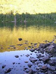
I thought I was done, but I think I'll play some more. Meanwhile I want to share another Flickr pix that shares our January palette challenge. The photographer seemed intrigued that we actively seek inspiration for fiber art in nature. This picture struck me particularly because it seemed to portray strata of color and I had used a stripe for my foundation.
yellow and blue water reflections by Zombie37 Lake in blues & yellows - Acadia, by Zombie37

Sunday, January 13, 2008

TAKE IT FURTHER CHALLENGE

First, if you haven't heard of the Take It Further Challenge, you should check the link. It is Sharon Boggan's 2008 challenge, and I have just started on January, along with 293 other registered participants. I'm going for the color palette:

As soon as I saw it I was reminded of a sweater I've admired for awhile. I've drooled over the picture and pattern so often, it looks like my copy of Knitter's Magazine, Spring, 2000, has been left in the rain. The colorway is not exactly the same, but similar with the play of greens and purples. What looks like grays & blues in the picture is really sage and teal . This is the Mitered Mozart, designed by Candace Eisner Strick, and believe me, I would have made it by now if only I could wear a short cropped garment. I searched the Ravelry site and found a beautiful example. I saw the sweater the summer of that year made up and displayed in a yarn store; the main color chosen was a royal blue, best I can remember.


Another thing familiar about Sharon's palette are the mint green and what I know as medium leaf or jungle green. The two almost seem at odds, the mint being cool and the leaf much warmer with yellow, and it bothered the heck out of me when we had our house painted a few years back (the trims were supposed to be medium and light leaf). In time I've either gotten used to the contrast or the sun has mellowed the mint to light leaf and now appears the identical color to the lichen on our trees. Such is my peripheral view out the window when seated at the computer.

To start the challenge, I gathered up my paint color cards and attempted to match the given palette. I have an abnormally large number of greens because I'm always questing that elusive silvery green of... Well, it wasn't long before I was waxing nostalgic and singing my college alma mater in my head:

"Where the Truckee's snow fed waters fall from mountain's crest,

Where the mountains meet the sagebrush by the sun caressed,

Cradled by the silver mountains neath the western blue..."


Oh, it got worse. I started searching for sagebrush on Flickr and found these wonderful pix.

I hope you'll take a minute or two and take a peek, especially if you're intrigued with the purple and green palette or just great photography:


Next I copied Sharon's palette into my Paint accessory and used the eye dropper tool to pick up the individual colors. I tried to play with a design, but best I could do was see how the colors could interact. Now if you'd like to see the real magic worked by someone savvy with a sophisticated application, Francoise's blog Creatilfun is pretty amazing.


Now for my favorite part of any project, picking through stash. Mind, I still had no clear picture of what I might make with the palette, but I found plenty in my CQ fabric pieces, thread assortments and beads to provide plenty of latitude. At last I opted to do a small, do-able CQ piece and wrestled with the ideas of using delinquent TAST stitches and even combining that with my even more backlogged BJP. Crazy quilting is the format; we'll just have to wait and see what develops beyond that.


Right off the bat I found my verifying fabric, that's the one that contains the entire palette so I know everything can work together. It was a small square of batik. In the interest of keeping the project simple and do-able within a couple of weeks, I did minimal piecing.
I began with the green dupioni and placed it right sides up together with the lavender satin (I think hand painted by Karen South) and cut a gentle curving line. Next I put right sides together and machine stitched matching hills & valleys. My plan was to repeat the procedure with the next pairing, the purple and yellow-green dupionis. Unfortunately I forgot to allow sufficient width to allow for a second seam. Waste not! I seamed what I had and left the curved edges raw and overlapping the outer edges of the starter pair. Not wanting to repeat the mistake I simply straight seamed the end colors, on the left a silk velvet, on the right a crinkle-textured irridescent that flashes yellow and lavender. Too bad you can't see the latter; it's a piece I received in a squishy and it has the most marvelous handpainted flower that I'm reserving for another use.
Once the strips were sewn I fused a medium light, nonwoven interfacing to the back.
I have started the seam treatments, dealing with the raw edged pieces first. My intention is to use embellishment for "curving" the straight seams.

WOMEN FOR WOMEN ON 60 MINUTES

A while back I posted about an auction offered by the International Freeform Crochet Guild based on the guild's 2007 challenge. Proceeds went to the Women for Women program which will be featured tonight on CBS's 60 Minutes in a segment called "War against Women".
Here is the press release email received by the guild and posted on IFCG's Yahoo Group:

Dear Friend,

CNN's Anderson Cooper will be highlighting the plight of the women inthe DR Congo on the venerable CBS news magazine, 60 Minutes. The showwill air at 7:00 pm on Sunday, January 13. Check your local listingsfor exact air times and please forward this to your friends to spreadthe word.As you know, every day in the Congo women are being traumatized;their suffering used as weapons of war. Anderson Cooper and 60Minutes visited our operations in the DR Congo and met the women weserve. The 60 Minutes piece, "War Against Women", will enlightenthousands more to the unspeakable violence these brave women faceevery day as well as the hope for the future that the Women for WomenInternational program brings.We invite you to watch the show or set your recorder. Check ourwebsite, www.womenforwomen.org/congo, for more information andcontinued updates on the show, to make a donation, or to learn moreabout the women of the DR Congo.We are grateful for your support and for the opportunity to share thestories of the women around the world with even more people.

On behalf of the women we serve,

Zainab Salbi
Women for Women International CEO and Founder

P.S. This is the perfect chance to spread the word about Women forWomen International! Invite friends and family to watch 60 Minuteswith you. Please forward this email to friends and family or takethis opportunity to write about us in your blog.>>>