


(real and now otherwise!) has become one of my favorite things to do. In fact, you don't want to shop with me if it involves selecting colors for anything unless you're willing to spend hours of
blissful abandon trying this, that and the other together, then stress with me while I try to
choose which combos I like best. Strangers have made this mistake asking my opinion about a
tie selection or putting some yarns together or... You get the idea. I do spend double duty in
hardware stores playing with paint chips or browsing for "stuff" I could use in crafting.
I have several excellent books on color theory, which I have read and enjoyed at an academic level, but truly much of what is suggested comes automatically to me without my having to know the why of it. This is not to say that my palettes are always perfect. They are pleasing to me, which is enough, but I'm frequently guilty of sticking with favorite colors. Well, I love them, and they're soooo comfortable. It's elementary to know that a print fabric will yield all the colors necessary; duh-uh, we can even follow the dots printed in color on the selvedge of some fabrics. To marry two or more solids that don't seem quite right, put them with a multi that includes those colors to "verify" compatibility. Of course there are proportions to consider, but that's another subject.
To me it's a given that nature is our best palette source, and what we can't see with our own eyes we can see in photographs or through the macro lenses of National Geographic photographers. This brings me to Sharon B's first lesson . Among her many useful suggestions for discovering and recording colors was a link to an online color generator . I must confess, I had so much fun playing with this utility, I put off doing my homework! I googled images.I used my own. I just had a ball. However, not all the time was wasted. I did perform some experiments related to my course project, and as you'll see, I got my homework done!
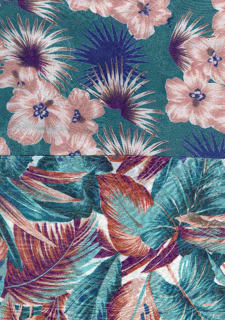
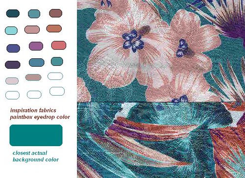
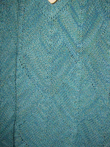
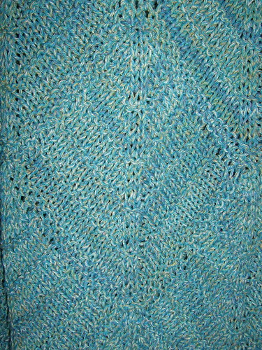
Here are two prints I selected to begin the palette for my patchwork block. Anyone who's bought fabric or fiber online knows, albeit forewarned, is that virtual color is not always accurate. The actual teal of these fabrics is greener than shown.
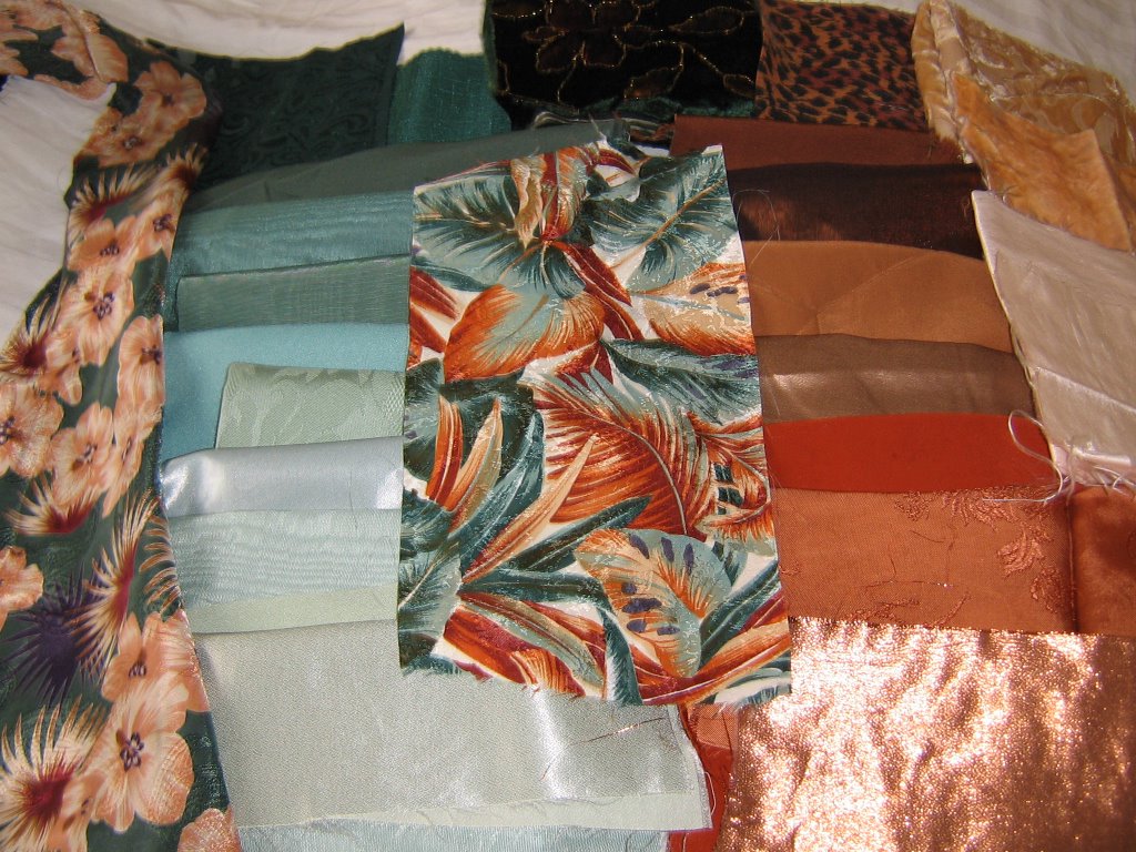
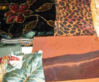
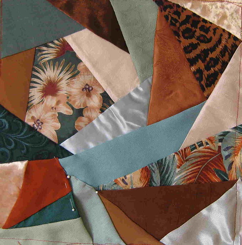
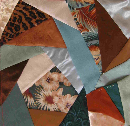
These are my final fabric auditions pulled from my stash to complement the basic prints. Photos may not show the variance in materials, sheens, textures, etc. Most are silks; there is some handpainted velvet. As usual, I get carried away by the many possibilities and am left with the
almost painful task of elimination.
Before I reveal my end result, I have to tell you about my experiments. In the first one I used the Palette Generator and got a result you can see at:
http://jrm.cc/color-palette-generator/?image=images%2Fscan0006.jpg&steps=3
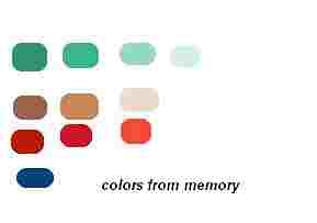
Next I created the palette from memory as best I could using my Paintbox accessory. Then I inserted the image of my fabrics into Paintbox and used the eyedropper tool to pull colors to create a virtual palette. Scroll down to see remaining pix.
