About Me

Showing posts with label "design inspiration". Show all posts

Friday, January 28, 2011

WHERE THE WILD THINGS PLAY

There are almost 1500 participants in Workshop I of the Strathmore Online SeriesPam Carriker has been the instructor for this first class in visual journalling.  I mentioned earlier that our objective for this 4-part workshop was to build a new journal page collaged from our own old art and other recycled materials.  There's been quite a buzz about Pam's new book, Art at the Speed of Life; you can catch a preview and mini-tutorial by the author here.
Where the Wild Things Play
I added fiber streamers and decorated tags to the spiral binding of the page.  The tags have more phrases like, "Bright colored jellies with ribbons that sting", etc. This being a journal page it is filled with feelings and symbols apparent to no one but myself.  Some of the imagery is dark rooted , but others aren't really the morbid fascinations they seem.  See my post about the Creature from the Black Lagoon doll . 
Below is the original collage and thumnails of the recycled "art".


Wednesday, September 15, 2010

TAST 2010 - WOVEN TRELLIS & RAISED CHAINS


MY STORYBOOK DREAM
 
I sought a place to have my lunch
Beside a stream of tropical punch.
Fruits and berries came in handy,
But oh! those flowers made from candy.
'Neath leaves of green so sweet and minty
I rested my tummy full of plenty.
Leaning against the chocolate wood,
I tasted some bark and it was goooood.
Fluffy clouds of marshmallow cream
Floated past in my storybook dream.
When at last I woke from my nap,
I found this stitching in my lap.

TAKE A STITCH TUESDAY - WEEKS 27 - 29:  WOVEN TRELLIS and 2 VERSIONS OF RAISED CHAIN.  These links will take you to the tutorials for these stitches.  You can also visit the TAST Flickr Group Pool to view work by many participants.

All of the flowers are woven trellis with the exception of the one centered on the left; it is Version 1 of the raised chain as is the rainbow banner. The circle and scroll are Version 2.  A single strand of Caron Watercolours was used for the major elements, although the rainbow and border straight stitches are done with Caron Wildflowers, a single strand.  The accents on the flowers and other background stitches were rendered with Stef Francis silk or cotton perle.  

At this point I feel obliged to explain the poem.  I wasn't very happy with my woven trellis flowers, but they were better than the ones I ripped off another piece of fabric.  I didn't really want to work any more and decided to put a hold on the sampler until the next TAST.  I worked the two versions of raised chain, and still wasn't at all pleased with the look of the overall piece.  No wonder.  It was clearly hodgepodge and totally unacceptable to me.  I kept coming back to it and adding things, starting with the additions to the major flowers.  Before I added filler stitches I pondered for days about the big rainbow thingy.  knew it was a stream of something delicious fed by a soda spring.  But how could anybody looking at the stitchery connect to my childlike fantasy.  So I wrote the little poem to convey the imagery to the viewer, not so much that I thought viewers would be clueless , but more to my thinking the sampler couldn't stand on its own.  I like this stitched piece now.  It makes me happy and evokes memories from the naive imagination of my childhood when my mother read me stories about candylands, sausage trees, lemonade seas and popcorn snorting dragons and Shirley Temple sang about the Good Ship Lollipop.


Friday, February 05, 2010

SO FAR SO GOOD!

I've been absorbing myself in Transformative Dollmaking, the Joggles class I'm taking from Pamela Hastings. Among other things, our first assignment called for us to make a paper doll that reflected our happy days and the not so good ones.  I complied with a two-sided doll based on a pattern she supplied.

To the right you see me tickled pink and tripping the light fantastic above my desk.   This was my first play with paper collage, so the educational experience was doublefold.  I have so much to learn.  Never mind that my foil wings bear glue smudges and fingerprints.
Never mind that my mylar stockings are wrinkled.  Never mind that my tissue paper arms were so tattered I had to cover them with lace.  I played.  After applying my acryllic facial foundation, I put on minimal makeup with a pen.  I styled my hair with petals from an old carnation corsage.  A little stick-on bling at my neck and a big heart do it for accessorizing my dowdy, somewhat old fashioned print dress.  I am happy today.

Below is my alter ego.  Thankfully I'm an optimist and born with a sense of humor that sustains me in difficult times, so even though I can be as witchy as the next gal, my anger is typically short lived.
Most of my bad days stem from frustration, impatience, discouragement, and fleeting resentments.  My depression is genrally controlled by medication, although I do occasionally have anxiety breakthrough.  My recent grief was the first time an emotion left me debilitated.  I would never have imagined  that creating a grouch could make me laught and have so much fun.


My beloved DH cringes whenever he sees me saving "stuff".  If you're reading this, you know what I'm talking about.  There are times he vocalizes that I hoard and belong on a certain TV show.  I will allow only that caching stash is sometimes problematic. I mention this only because I got to use some unlikely keepers in this project.  Like that corsage I mentioned?  From a commercial floral class about 20 years ago. 

Also unlikely are the wings.  I'm not sure why a witch would have wings unless she's fallen from grace.  Anyway they're tarnished.  Look closely.  That's embossed toilet paper I used to blot while I sprayed various inks and starbursts and saved from an earlier project.  It absorbs beautifully and randomly in color and stays strong; it worked fine with the gel medium I used.  And you know, I'm not sure why my happy side has wings.  Maybe  they  symbolize my resuming creative flight.

My inner imp is wearing a dyed coffee filter!  Yes, yes, last week I decided to experiment with some months old cold water dye solutions.  I dyed bleached and unbleached filters and learned the bleached come out a little brighter.  This particular one is unbleached and chosen to match the catalog cutout of "The Witch is In".  Do not ask why I owned a gold bandana with primitive hearts, as I have no clue.  But I love how the heart looks pierced by pins to cause me pain.  The arms are coffee filters given a multicolor treatment with the same dyes.  The dye bleed like watercolors on the filters; I just dropped the color randomly and watched it run and marble.  I did purchase paper for the legs.  I could not resist the filigree and spider webbing to sub for fishnet stockings.  My witchiness has a sleazy side as evidenced by those tarnished wings, and I suspect her presence by my computer is to lure me to a game of scrabble or spider solitaire, anything to keep me off productive task.

Wednesday, April 15, 2009

Stitch Exploration 09: March - Assisi

T

The rose to the left is from an internet pattern. I just used part of it to get a feel for the stitch. I've done cross stitch , and although I know Assisi work in principle, I've never stitched it.

I have trouble recognizing negative space, so I was relieved to learn I could outline before working the background if I wanted. Next I had to figure out what to use as a design. I couldn't get past the association of St. Francis whenever I tried to think Assisi .
I wanted some color for the background but didn't have the ambition or time to attempt an outdoor scene. I went for a stained glass look , contemporary, with a hint of a cross and just the suggestion of a church window. Most of the background filler is cross stitch done with single strands of cotton floss. As you can see I ran out of fabric length.

Sunday, November 02, 2008

CREATURE FROM THE BLACK LAGOON


My latest healing doll! He may appear fearsome, but if you recall the films, the Gillman was no monster, just a misunderstood biological anamoly who scared the living daylights out of Julia Adams' character along with all the teen girls in the audience back in the day. The Creature from the Black Lagoon movies have become cult classics in the genre of 50's B movie sci-fi. The Gill Man films have always been faves in my family, so when the need arose for a healing doll for my daughter, the Creature jumped first into my imagination. Hey, it was either him or a great white shark; she collects both. She has some surgery coming up, and I wanted to make something to cheer and heal. My choice was easy. I don't think Jaws could ever be considered benign, do you?


Truth be told, it was the fabric that brought on the idea. I found it while browsing a local fabric store in CA last month. As soon as I saw it I knew what it would be, and I started work on it that very evening. I cut the pattern freehand , a technique my mother taught me. The doll's head should not be as pointy as it turned out -- my mistake for leaving the turn opening at the top.

I sewed him by hand (next time I may try my mom's 40's era Singer, probably still works), not
the best thing for dolls, but I did try to reinforce in the curves. I covered the seam line with beads. He has seed beads to outline his mouth (I read that the actual creature costume had bright, bubble gum pink lips which for some reason gave the right effect when filmed in black and white) and olivine crystals for eyes. Of course I tucked a prayer and appropriate crystals,
purified and programmed for target healing and overall wellness inside the Creature. I think my daughter will be tickled when she receives her doll.

My thanks to Mai-Liis Peacock for introducing me to the joys of making and presenting healing dolls. I am already at work on the first project for her new angel class. Below is a peak at the fabric I will be using for the abstract flying angel (think Chagall!).

Monday, October 27, 2008

TWO NEW EXCITEMENTS

I'm back, relaxed and no longer mired in catch-up. If you'll recall I put previous group activities on pause and gave myself permission to quit as long as I needed to. I did manage to get in some creative time during my stay in CA. I knit. I started a doll. I made some floral arrangements. I got to do some sightseeing, pix of which you can find on my Flickr site .


Within 24 hours of my return I had signed up for another class. And maybe a day later I enrolled in another! I know, I know, your're already admonishing me for setting myself up to fall behind again. But understand, both teachers are wonderful instructors and the contents are such that I can work when and as I wish.


I have already gathered in supplies and started on Sharon B's Joggles course, Studio Journals: A Designer's Workhorse . I need this class -- desperately! Before I had a computer I kept art and craft ideas in manila folders. The ideas were magazine clippings or notes hastily scribbled on whatever was on hand while watching TV how-to's. On my lifelong quest toward organization I filed, sub categorized, made new files and labels and soon had a complete file cabinet filled with snippets of ideas now long forgotten. My current computer (#2) has two files with pix and notes for ideas I'd like to work with some day. One I called a visual journal and the other "Concepts".

Both are so long, they're taking forever to load and just as long to scroll down to find stuff. At the same time I've tried keeping journals for each interest one for CQ, one for knitting, beading, freeform crochet, embroidery -- the list goes on ad nauseum. Of course no journal was ever handy when I needed it, and if I travelled the idea of hauling these suitcase-filling journals was absurd. Like I mentioned, this class is a must .


In theory my artistic productivity could increase if I could just corral the ideas. If I could only wrangle them into one place... well, I'm already thinking two, a big one for studio use and development and a small one for thoughts on the go. Sharon told us to just start in the new book, get something on that first page. Mine happened to be a watercolor paper, so I dug out my watercolors to do a simple decorative wash and was aghast that I'd really forgotten techniques long ago learned. Since my overall premise is ideas out of sight are soon out of mind, I thought of lightbulbs to symbolize ideas. I soon got carried away and had makings for collages, stitchings and even dolls. Working the exercises from Lesson 1, I have more ideas in the development stage. So it's already happening;
creative concepts are replacing idle thoughts of a sedentary mind.
Speaking of dolls, I'm very excited about Mai-Liis's latest offering, the Angel Project. I took away so much more from her healing dolls class, I know I won't be disappointed in this one. There's still time to sign up for this very affordable course which is conducted via a closed Yahoo Group. I will shamefully admit that if you mention my name, I will receive a perk in the form of a squishy. That of course is not as important to me as learning ways to make dolls and embuing them with a spiritual essence or intent!

Wednesday, May 28, 2008

A NAME I CALL MYSELF - TIFC May

The May challenge concept is a question I ponder all the time. What do I call myself when trying to explain my creative endeavors? When I tried to work through The Artist's Way , polite arguments in my head erupted into battle. Considering myself an artist won out for the time being, but that word itself is inadequate to describe the scope of activity in which I engage.

I invisibly wince when an outsider responds, "Oh, you do crafts!". My body reacts with an inward cringe if they add, "Me, too!" My inner snob and judgemental self silently separate that crafter from me and my artistic values. For me the difference has to do with creating from within, compulsive self expression, following a whim or instinct rather than a pattern. For me the barrier has nothing to do with technical proficiency or aesthetic appeal. My TIFC above, albeit an exercise, is a piece of art because it is a piece of me. It's not pretty, doesn't show proficiency, but it's not intended for anyone but me.

Let me explain my interpretation of both concept and palette for this month's challenge. In a nutshell, I'd resort to looking in a crystal ball to find a suitable name for what I do.


a. needle artist

b. fiber artist

c. textile artist

d. mixed media artist

e. all of the above

f. none of the above

g. some of each

Most of my artistic pursuits involve thread or fiber, some kind of needle or hook. For sake of convenience I generally tell people I'm a fiber artist, leaving them to presume I spin and weave (I don't -- yet) and no inclination that I bead. I have no commercial goals; I keep or gift everything I make. I love to learn new techniques and share what I learn. I have fun. All the time. And to those of you reading this, you will understand why I call myself

FIBERDABBLER. I don't know that there is an answer to the May concept question. Dare I suggest it doesn't matter semantically how others perceive us? I'm evolving, and I love the mystery of not knowing what comes next.

Thursday, May 08, 2008

I LOVE LUCY

Lucy Nieto, a fellow Flickr user, contacted me the other day to ask if she could use my April TIFC design to create tiles. I agreed, not really sure what she meant until she sent me the results. Wow! I then asked permission to show the results here, and in the meantime she created another series with my Take a Stitch Tuesday #30 design, and I have to say her results are prettier and far more dynamic than my originals! Lucy tells me she uses a Kaleider software and sometimes FilterForge. Below are some of my faves, but you see them all together here.

It is well worth your time to browse Lucy's photostream. She doesn't just play with digital imagery toys, she is a wonderful photographer as well. You'll enjoy her macros, textiles, textures and a love of color that is truly inspirational. Thank you, Lucy, for sharing your creative world!

Tuesday, April 22, 2008

SNEAK PREVIEW OF MARCH TIF


Colors from the March palette reminded me of oriental rugs which made me think of the decorative grandeur of the Ottoman or Moghul Empires.

I allowed my Creative Inner Child to fantasize about magic carpets, sultans and Scheherezade. Then I made a crude sketch for a design of paisley motifs and scooped up some black burlap and all the threads, ribbons and yarns I had on hand I thought might match the palette. No time to search for beads, but there was a good LRS where I was headed in CA.

I cut a piece of burlap and backstitched the perimeter I wanted, allowing enough border to fringe. This seemed natural because the weave of the burlap was so loose. Once I started on the actual stitching, I quickly realized I was not conforming to the lines of my original sketch. I drew another more closely resembling the form and direction my stitches were indicating.


April was upon me before I could get to the bead store, so I started on this month's TIF, which went quickly given that I had no decisions to make regarding which stash to use. I made do with what I could eke out from what I had with me, supplemented with some flosses and perles found at a local fabric store ,where I also invested in some ivory colored, loose woven raw silk for the background.
I don't have too much left to do on March's TIF, just a little more stitching and beading. I'll post a finished presentation in a day or two.

Monday, January 28, 2008

I DUNNO...

... perhaps I should have left it alone. There's not that much different; I just filled in a couple of gaps.

With the exception of a cotton thread or two and the yellow cord, flosses and perles are silk and hand painted by Victoria Clayton. The feather stitching is done in perle and the chain
stitches are the same colorway done in 2 strands of silk floss. I'm not sure of the name, but it was from Vicki's dragon series. The chenille is also hers, and most of the silk ribbon, too. I used a bead soup of assorted sizes to fill in some of the negative space between the feather stitches.
On the far right the little flowers are purple sequins with size 8 triangle beads, which stand up in the center. The two purple pailettes in the center top are dyed shell, rough sides up.

I really came to enjoy this palette challenge and was surprised that I was able to work entirely from my stash.

Sunday, January 13, 2008

TAKE IT FURTHER CHALLENGE

First, if you haven't heard of the Take It Further Challenge, you should check the link. It is Sharon Boggan's 2008 challenge, and I have just started on January, along with 293 other registered participants. I'm going for the color palette:

As soon as I saw it I was reminded of a sweater I've admired for awhile. I've drooled over the picture and pattern so often, it looks like my copy of Knitter's Magazine, Spring, 2000, has been left in the rain. The colorway is not exactly the same, but similar with the play of greens and purples. What looks like grays & blues in the picture is really sage and teal . This is the Mitered Mozart, designed by Candace Eisner Strick, and believe me, I would have made it by now if only I could wear a short cropped garment. I searched the Ravelry site and found a beautiful example. I saw the sweater the summer of that year made up and displayed in a yarn store; the main color chosen was a royal blue, best I can remember.


Another thing familiar about Sharon's palette are the mint green and what I know as medium leaf or jungle green. The two almost seem at odds, the mint being cool and the leaf much warmer with yellow, and it bothered the heck out of me when we had our house painted a few years back (the trims were supposed to be medium and light leaf). In time I've either gotten used to the contrast or the sun has mellowed the mint to light leaf and now appears the identical color to the lichen on our trees. Such is my peripheral view out the window when seated at the computer.

To start the challenge, I gathered up my paint color cards and attempted to match the given palette. I have an abnormally large number of greens because I'm always questing that elusive silvery green of... Well, it wasn't long before I was waxing nostalgic and singing my college alma mater in my head:

"Where the Truckee's snow fed waters fall from mountain's crest,

Where the mountains meet the sagebrush by the sun caressed,

Cradled by the silver mountains neath the western blue..."


Oh, it got worse. I started searching for sagebrush on Flickr and found these wonderful pix.

I hope you'll take a minute or two and take a peek, especially if you're intrigued with the purple and green palette or just great photography:


Next I copied Sharon's palette into my Paint accessory and used the eye dropper tool to pick up the individual colors. I tried to play with a design, but best I could do was see how the colors could interact. Now if you'd like to see the real magic worked by someone savvy with a sophisticated application, Francoise's blog Creatilfun is pretty amazing.


Now for my favorite part of any project, picking through stash. Mind, I still had no clear picture of what I might make with the palette, but I found plenty in my CQ fabric pieces, thread assortments and beads to provide plenty of latitude. At last I opted to do a small, do-able CQ piece and wrestled with the ideas of using delinquent TAST stitches and even combining that with my even more backlogged BJP. Crazy quilting is the format; we'll just have to wait and see what develops beyond that.


Right off the bat I found my verifying fabric, that's the one that contains the entire palette so I know everything can work together. It was a small square of batik. In the interest of keeping the project simple and do-able within a couple of weeks, I did minimal piecing.
I began with the green dupioni and placed it right sides up together with the lavender satin (I think hand painted by Karen South) and cut a gentle curving line. Next I put right sides together and machine stitched matching hills & valleys. My plan was to repeat the procedure with the next pairing, the purple and yellow-green dupionis. Unfortunately I forgot to allow sufficient width to allow for a second seam. Waste not! I seamed what I had and left the curved edges raw and overlapping the outer edges of the starter pair. Not wanting to repeat the mistake I simply straight seamed the end colors, on the left a silk velvet, on the right a crinkle-textured irridescent that flashes yellow and lavender. Too bad you can't see the latter; it's a piece I received in a squishy and it has the most marvelous handpainted flower that I'm reserving for another use.
Once the strips were sewn I fused a medium light, nonwoven interfacing to the back.
I have started the seam treatments, dealing with the raw edged pieces first. My intention is to use embellishment for "curving" the straight seams.

Thursday, June 14, 2007

MY FRIEND FLICKR

I don't recall when I started posting photos to Flickr but I think it was because it was an easier way to blog at the time, plus I had become dissatisfied with my previous photo hosting site. I came to appreciate Flickr's many upgrades, conveniences and greater efficiciency and eventually purchased a pro account so I'd have more space to store my photo collections. I started out just uploading pictures of my various projects, then sets of photos to be viewed by family and friends, finally pictures from my travel I left public for anybody to peruse. Beyond that I only used the site for show and tell and discussion within my limited groups, like CQ,
embroidered motifs, and those created in conjunction with Sharon B activities.

But one day my life with Flickr changed. It began when a comment was posted on this picture. It was one of many shots I took in the Badlands and I'd titled it simply "Strata". Imagine my surprise and curiosity when I was invited to join a geology group.

I checked it out (I really do have an interest in rock formations and minerology) and discovered Mark Willocks whose landscape photography is everything I wish mine could be. I take snapshots; Mark captures those creative visual essences I can see but never reproduce. I had just completed 
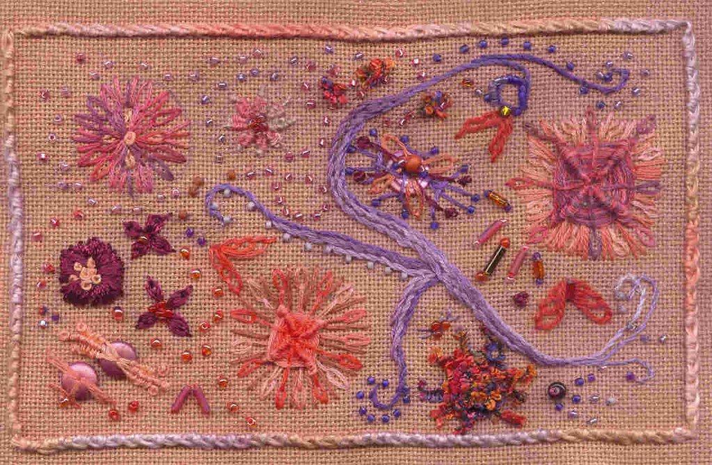
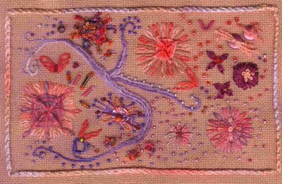
Density and Diffusion for Sharon B's Developing a Personal Library of Stitches class. Landscape, strata of canyon walls contrasting with water, memories of travel through the Southwest -- all influences in the back of my mind as I stitched. You can see how Mark's images of Yellowstone and other western venues just took my breath away. One look at his recent National Arboretum Pool Reflections series, you'll also see how Mark is equally brilliant with any subject.

Besides admiration for a photographer I learned more. I learned to truly make use of Flickr for artistic inspiration. I started searches by subject starting with geographical landscapes. When I came upon a Flickr users whose work I liked, I'd mark the pictures as faves for future inspiration and add them as contacts so I could more easily find their Flickr sites and see when new photos were posted. And if I want clues as to their inspiration, I read their profiles and take a look at their favorites, groups and contacts. So many of us credit nature as inspiration. How many design students are encouraged to look through magazines like National Geographic for ideas. I will never have to cut up another magazine!

Flowers were next. Looking through the flower groups (there are many!)or groups like on Flickr reminded me how much I love macro photography and wishing I had the equipment to do it myself. When I found the group Natural Abstractions I was elated, the moreso because I discovered Sue whose work is stimulating and consistantly view worthy. When I visited her Flickr site and saw her organization of sets, well, just see for yourself!

This morning I learned about Miksang with thanks to Arlene Barr's blog, and I must agree the concept transcends photography; it's about any way we see something and communicate it through artistic expression by any means. From my reading so far I'm gathering the idea behind the photographic Miksang has nothing to do with the grandeur of nature, but rather attention, awareness and appreciation of our ordinary surroundings.

If Flickr isn't my new best friend, it's rapidly becoming one of my best resources. I hope you'll take a moment to browse my favorite photos by other users . Here is the link . I'm always surprised when I stop in. It's teaching me a lot about my preferences in composition, color, line.

Monday, November 27, 2006

FLOWER POWER -- EEEEEEK! RUN!

Run fast! Run for your lives! A lilac creature is in pursuit of my flowers. Looks like a flower child had a bad trip. I should call this "Why I never dropped acid!" Oops. Sorry. The picture should be oriented this way:


On the other hand, this way looks just as chaotic and just about as scary. I could call it "Nightmare at Haight-Ashbury. This is a sampler I started during week 2 of Sharon's class, the lesson about point. I started with the 3 butterflies -- geesh, can you even find them? Then I wanted to practice some different flower techniques. Imagine my surprise when the first turned out like a gods-eye (more flashback: tie died tees, macrame...). I tried to disguise it with more petals, and the shape got away from me. Added some straight stitches to give it more body, and there you have it, the square flower, a horticultural miracle. Perhaps I shouldn't say, but I actually liked its tranformation as a primitive weaving.

One of the other big flowers is rather tribal-looking, too. I would have been happier had the center been more round, but I realize the number of spokes plays a major role. I skipped the weaving on the the third large flower , then continued playing with the wrapped and woven thread technique on the smaller flowers. I especially liked the star flower with the woven petals, and I liked the boucle effect produced by less than consistent wraps around individual threads in the upper right hand corner. I was ravaged by guilt working this technique, knowing I have 13 more woven and wrapped motifs still to do for my Options in Hardanger class.

I have no idea why I kept going at the sampler, except I wanted to see where the point concept would bring me. In the back of my mind I envisioned seed beaded paths interspersed in barer areas with cascades of tiny buttons and bead assortments. While I love the practicality of the postcard size sampler, it can be creatively limiting -- no wait, I forgot about the purple doodle that ran rampant and morphed into an oversized K (my married surname? Granddaughters Kaitlyn and Kellye? My grandmother Kathryn aka Kay?) and hogged at least a third of working space.

Why did I keep going? Well, we are supposed to be exploring and experimenting. I just wanted to see if I could pull off a visually balanced piece. My conclusion is there is too much clutter and lack of unity. The stitching did not have my full attention and it definitely shows. Still it was a fun exercise in which I could relax and do whatever. Another plus for the postcard format.

And just so you know, while I was born and raised in the San Francisco Bay Area, I was too young to be a Beatnik and too old to be a Hippie.

Saturday, November 18, 2006

MORE TO THE POINT!


Contemporary Australian fabric representing aboriginal dot painting. Here points are used to outline and isolate images (flowers, leaves, ant/termite hill). Concentration of dots represent specific things symbolically like desert, river, swamps, giving geographical clues to rendered environment. Although the larger circles are placed symmetrically, the bugs are arranged randomly and strongly emphasize movement. Simarlarly the leaves, if that's what they are, seem to signify direction, which to my interpretation is circuituitous.

Inspiration for this fabric comes from molas, colorful applique created by the Kuna women of the San Blas islands of Panama.
The playful dots in the background create movement and make the eye rove around to the various mola type animals, which are points in themselves and arranged in a way to bring movement to the entire pattern.


Big dots and little dots. Background dots move and alter shape of

foreground circles.

Dots as beads, arranged to create the appearance of Native American bead weaving. On the other hand it could simply come from a photograph of beads embroidered into Indian motifs on a black cloth. No matter, the images are a mosaic of points; each dot is a component of the greater picture -- rather like pixels!

I see bright dots orbiting around poles. No, wait, the poles with their satellites are moving in a dimensional wave. Definitely motion, most definitely an optical illusion. Somehow the notion of this fabric made into a tie or a shirt or a dress is rather scary. My grandmother gave me such a skirt once -- and it waaa-ay before the sixties.
A skirt that plays with people's minds; could explain a lot about how other kids responded to me as a child. Or now, when I confess I really, really like this fabric and am going to have to splurge on at least a fat quarter!


Another nice study of patterned points. And although this print is more subdued than the one above, it too is contrived to create illusions. The more you look, the more you see. Besides in and out movement, there are secondary designs like the one created in the negative space between the big dots. Once you see them they become points themselves. And just what is it that creates the effect of colored stripes? Background color, right? Does it make your head hurt to try to discern precisely where the stripes are? I think it's a wonderful design , and I can see its application to stitchery. But I wouldn't want to wear it. I wouldn't want it on my bedroom walls.

Man has always fixated on points in the night sky. My guess is that was probably the earliest version of follow-the-dots. I think most cultures incorporated constellations into their folklore. I am only able to recognize the Big and Little Dippers (Ursa Major and Minor) and that great trapezoid in the sky, the Southern Cross . I cannot identify other celestial clusters, probably because the dots have no numbers to guide me from one to the next. I worked a lot this summer on a fulled wool CQ block with tribal themes from the Pacific Northwest. One of the motifs I've planned includes the bear constellations, so I bookmarked some sites that showed them outlined.

TO THE POINT!

Part of our ongoing homework in Sharon B's Personal Library of Stitches class is to look for examples of point and line in design. Our teacher referenced some awesome examples of point
beginning with the obvious, Seurat's pointilism. In looking for additional links I came upon
The Pointilism Practice Page that teaches the concept behind the technique with an interactive tool that allows one to create dots of many sizes and colors and work them on a virtual canvas.
I immediately bookmarked the site for use as yet another color and design tool. There are also tools for palette painting like Van Gogh and or Japanese brush painting (kind of like Etch-a-Sketch gone Zen).

You know, I think I came upon this site serendipitously, as I googled pointilism rather than the possibly more common pointillism. The second listing in this search brought me to State of Entropy and a tutorial for pointilizing a photograh. Looking at the step by step, digital transformation of the Statue of Liberty make Seurat, Paul Signac and Pop Art seriography so old school in terms of time and mess. It's all so, so pixilating.

Speaking of old school, as in ancient, Sharon introduced us to Australia's aboriginal dot painting and its contemporary renderings by artists like Eddy Harris . I have always been drawn to primitive and ethnic art, but these dot paintings just shot to the top my faves list, especially after viewing another gallery site which provides even more eye candy including painted emu eggs!

When I first read the lesson part about seeking points, I immediately thought of Nancy Eha's Jungle Rhythym, a beaded art quilt I first saw on Simply Quilts. Those dot figures just leaped out at me, drawing me into their exciting world. You'll have to scroll down a way to
reach Jungle Rhythym, but it's worth doing slowly to enjoy Nancy's other work. I think that was about the time I started collecting ethnic themed fabrics. I think the primitive design elements really transcend cultural boundaries. I could easily mix many Australian, African and American Indian patterns when the ethnicity is non-specific, and I'm sure this is the commercial intention of the fabric designers and manufacturers. Reflecting just now, I'm realizing beads are an integral part of most cultures. Beads. Du-uh... Dots! Points!!!

I'll relay one more recent duh moment. I happened to glance at a tv commercial because the dots moving around were definitely attention-getting. I was proud of myself for spotting this
outstanding use of point, then appeared the primitive figures, then the didgeridoo sounds, then just as I was prouder still for recognizing aboriginal art influence, the hype for Outback Steakhouse began. Time for another sip of Alice White cab.